 English

Why Transparency Ratio Matters More Than Price When Choosing One Way Vision Film
Many buyers assume that a one way vision film is a single commodity. You order a roll, send a design to the print shop, and install the finished graphic on a storefront, only to discover that the image looks washed out or that the room behind the glass has turned into a dark cave. In most cases the printer is not to blame. The problem is the specification, and especially the transparency ratio that was chosen before anyone measured the window or considered how the space would be lit.
This guide walks through the decisions that matter most when selecting perforated window film for a real project. We will look at how transparency shapes image quality, how lighting conditions change what people see from each side of the glass, why low-grade material leads to expensive rework, and how to check a delivery before it reaches the installer. The goal is to help you choose the right specification on the first attempt, rather than paying for a second batch.
A film that prints beautifully on a sample card can still disappoint on a building if its transparency ratio does not match the viewing conditions outside and inside the glass.
What One Way Vision Film Actually Does
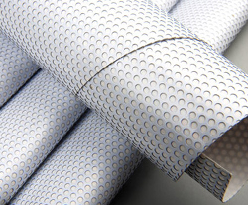
A one way vision product is a vinyl sheet covered with a large number of small perforations. The printed image sits on the outer surface, and the holes allow light and sight to pass through the material. The effect is directional. When the printed side is brighter than the room behind the glass, people standing outside see a clear graphic while the occupants inside can still look out. When the lighting balance reverses, the effect weakens or disappears entirely.
Three technical variables determine how a film performs in the field:
- Transparency ratio, which describes how much of the surface is open to light and how much is printable ink or solid material.
- Perforation structure, including hole size, spacing and uniformity across the roll.
- Adhesive and film thickness, which control how cleanly the material sits on glass and how well it resists curling or shrinkage over time.
Most sourcing mistakes come from focusing only on the first item and ignoring the other two. A ratio that looks correct on paper may still produce uneven results if the perforation pattern varies across the roll or if the adhesive migrates onto the glass after a few weeks of sun exposure.
Understanding Transparency Ratio in Practical Terms
Transparency ratios are usually written as two numbers, such as 80 to 20 or 50 to 50. The first number refers to the printable, opaque portion of the surface, and the second refers to the open portion that lets light and sight through. A higher opaque share delivers richer images, while a higher open share gives better daylight and a clearer view outward. The trade-off is direct, and there is no perfect setting that satisfies every requirement at once.
The chart below illustrates the general relationship between ratio and performance. Print vividness falls as the open share grows, while outward visibility rises. Actual results will still depend on ink coverage, print resolution and the brightness of the surrounding environment.
When comparing specifications, it helps to read each ratio against a clear application, not just against a number. The table below summarizes the four most common choices and the questions buyers should ask before committing to one of them.
| Ratio | Typical use | Practical note for buyers |
|---|---|---|
| 80 to 20 | Retail promotions and short-term glass graphics | Strongest image impact, but interiors can feel dim |
| 70 to 30 | Restaurants, showrooms and reception areas | The most balanced option for mixed requirements |
| 60 to 40 | Office floors and spaces where people look outward | Better daylight and view, with slightly softer color |
| 50 to 50 | Vehicle glass and situations where outward vision is required | Lowest image density, used when visibility comes first |
If you are unsure which ratio suits a particular window, start by describing the room behind it. The lighting inside often matters more than the design outside.
Matching the Ratio to Your Application
Each project category has its own priorities. The following groups reflect the most common situations that agencies, print shops and glazing contractors encounter, and they show how the same film can behave very differently depending on where it is installed.
Retail storefronts and promotional glass
Shop windows usually need maximum visual impact, because the graphic must hold attention from across a street. A higher opaque share works well here, especially when the store interior is lit brightly enough to keep the image from fading. The risk appears after dark. If the shop lights are turned down in the evening, the effect reverses and passersby may see the interior more clearly than the graphic, which weakens the advertisement at exactly the time when foot traffic is still active.
Restaurants, showrooms and reception areas
These spaces need privacy, branding and natural light at the same time. A 70 to 30 ratio is often the safest starting point because it balances image density with daylight. Designers working on hospitality projects should coordinate with the lighting plan early, since warm interior lamps and bright exterior sunlight can affect how the graphic reads from inside the room.
Office buildings and vehicle windows
Office glass and vehicle glass put a premium on outward visibility. Occupants need to see clearly, and drivers need an unobstructed view of the road. For these applications, a 60 to 40 or 50 to 50 ratio is usually more appropriate. Vehicle work also introduces movement, vibration and temperature swings, so buyers should confirm that the perforated window film has been tested for flexibility and edge adhesion before ordering a full fleet.
The Hidden Cost of Low-Grade One Way Vision Vinyl
Low-cost material often looks acceptable in a sample sheet but reveals its weaknesses during printing, lamination or the first season of outdoor exposure. The most common problems are inconsistent perforations, adhesive that migrates into the glass surface, and film shrinkage that lifts the edges of a graphic after installation. Each issue creates a different kind of cost, from reprinting and reinstallation to customer complaints and damage to the glazing.
Consider a composite case drawn from common field experience. A signage company accepted a bargain roll for a set of bus windows. The first units looked fine, but after a few weeks of heat, several panels showed uneven transparency bands, and the adhesive left faint marks on the glass when removed. The replacement project cost more than the original order, and the client lost confidence in the entire campaign. Nothing about the design was wrong. The material simply had not been tested for the environment it would face.
Three defects deserve particular attention during supplier evaluation:
- Uneven perforation density, which creates visible streaks or dark patches once the design is printed.
- Adhesive that stays soft or migrates, leaving residue or lifting at the edges over time.
- Poor dimensional stability, where the vinyl shrinks or curls and pulls away from the glass.
An incoming inspection checklist
Careful buyers check the material before it reaches the installer. A simple inspection takes only a few minutes and can prevent a large loss:
- Hold a sample against a bright light source and look for consistent perforation across the full width of the roll.
- Check that the release liner is dry and flat, because moisture can cause adhesive problems during application.
- Apply a small test piece to a clean glass panel and leave it for a day to see whether the edges lift or leave marks.
- Print a test strip with your actual artwork and compare the result under both daylight and interior lighting.
Inspection is not a sign of distrust toward a supplier. It is a standard step that protects the schedule, the budget and the reputation of everyone involved in the project.
Lighting, Night Effect and Installation Practice
Lighting conditions deserve as much attention as the ratio itself. A one way vision graphic works because of a difference in brightness between the two sides of the glass. During the day, the exterior is usually brighter, so the graphic remains dominant and the interior remains reasonably visible. At night, the situation can flip. If the room behind the glass is lit more strongly than the street, the privacy effect weakens and people inside may appear clearly to those outside. Designers should plan for this scenario by adjusting interior lighting, choosing a higher opaque share for the graphic, or adding a secondary privacy solution for the hours when the room is active.
The process from specification to finished glass follows a predictable sequence. Each step affects the final result, so it helps to keep the workflow visible to everyone involved.
Installation quality has a direct effect on how the film looks and how long it lasts. Three practices make the biggest difference:
- Clean the glass thoroughly, removing dust, grease and old residue, because contamination is the most common cause of bubbles and edge lift.
- Work with a squeegee from the center outward, pushing trapped air toward the edges so the adhesive bonds evenly across the surface.
- Cut the film with professional tools and accurate templates, leaving a small margin where the installation requires it.
Planning Your Order With a Manufacturer
Once the ratio, lighting conditions and installation method are clear, the next step is sourcing. A reliable supplier should be able to discuss technical details with you, not just quote a price per square meter. It is worth preparing a short brief before contacting any manufacturer so that the conversation can focus on the right specification from the start.
The following information helps a supplier recommend the correct product quickly:
- Glass dimensions and the number of panels in the project.
- Which side of the glass faces the public, and which side faces the room.
- The typical lighting level inside and outside, including day and night conditions.
- The print file format and whether the design includes fine text or large color areas.
- The expected quantity, timeline and any requirements for sample testing.
Manufacturers that control their own production lines can also support custom requirements more reliably. They can adjust the perforation pattern, the adhesive system and the film thickness to match the environment, and they can provide consistent batches for large projects. For wholesale buyers, this consistency is often more valuable than a small difference in unit price, because it reduces the risk of color mismatch between panels installed months apart.
If you are not yet certain about the right ratio, share the application and the viewing conditions first. A knowledgeable supplier should be willing to recommend a specification before you commit to a quantity.
Frequently Asked Questions
Q1: Which transparency ratio is the safest starting point for most commercial glass?
A ratio around 70 to 30 is usually the most balanced choice for mixed-use spaces. It keeps the graphic readable while allowing enough daylight and outward view for people inside the building. Final decisions should still be based on the lighting conditions of the specific site.
Q2: Why does the graphic sometimes look different at night?
The effect depends on the brightness difference between the two sides of the glass. When the interior is lit more strongly than the exterior, the privacy effect weakens and the room becomes more visible from outside. Adjusting interior lighting or choosing a higher opaque share can reduce this problem.
Q3: How can I tell whether a roll of perforated window film is good quality before installation?
Start with a visual check against a bright light to confirm even perforation, then test a small piece on clean glass for a day. Look for edge lift, adhesive residue and dimensional change. A short print test under your actual lighting conditions is also one of the most useful checks available.
Q4: What information should I send a manufacturer when requesting a recommendation?
Provide the glass size, the viewing direction, the lighting conditions on both sides, the print file details and the expected quantity. With these details, a supplier can recommend a suitable ratio and adhesive system and avoid specifying a product that does not match the environment.
-
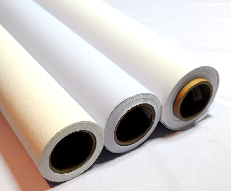 Hot/Cold Laminated Frontlit & Backlit Flex Banner
-
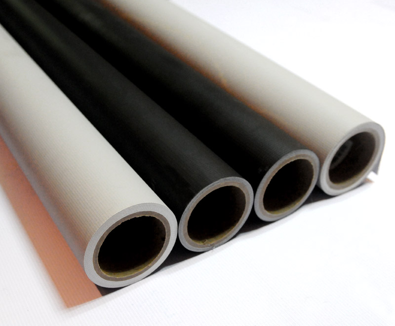 Pvc Blockout Flex Banner Roll Material
-
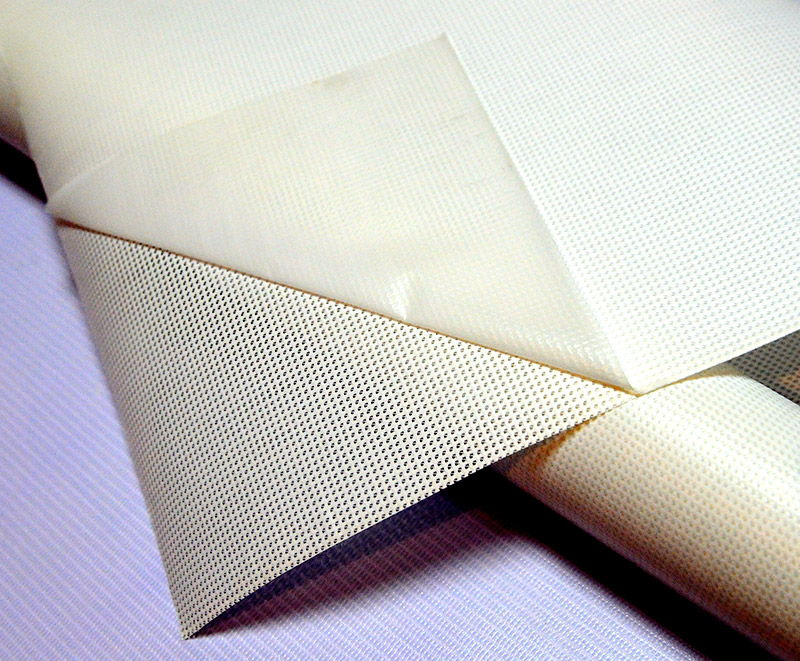 Pvc Liner Mesh Banner Material Roll
-
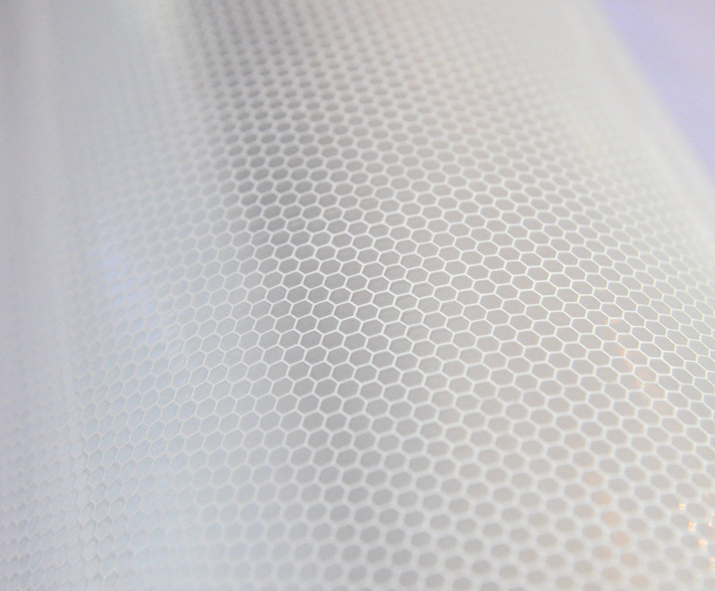 White Reflective Honeycomb Vinyl Sticker Materials
-
 Reflective Banner Flex For Outdoor Advertisement Sign
-
 Printable Reflective Banner Vinyl Roll Material
-
 Pe Pvc Stripes Tarpaulin Roll Fabric Material
-
 840d 1000d 1300d 1.02-3.20m Pvc Laminated Tarpaulin Fabric
-
 Rigid PVC Super Clear Stretch Film
-
 Digital Printing Vinyl
-
 One Way Vision Vinyl Film Sticker
-
 White Transparent Black Grey Self Adhesive Printable Vinyl
-
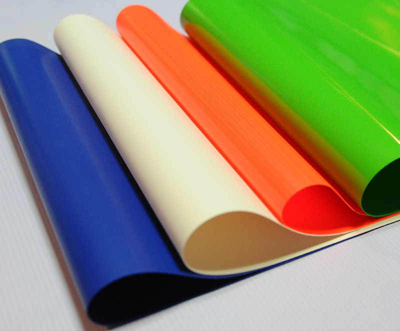 Heavy Duty Pvc Coated Tarpaulin Fabric
-
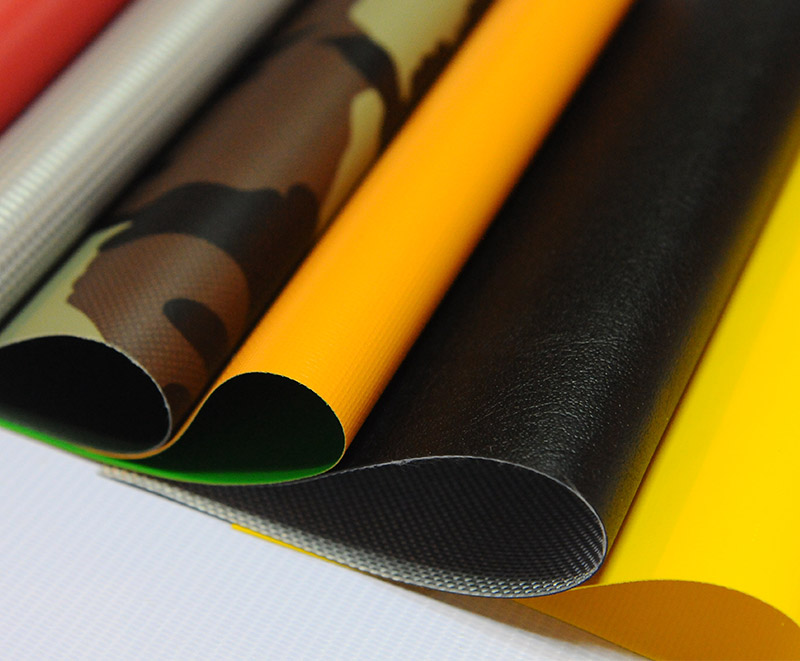 Pvc Coated Tarpaulin Fabric For Truck Cover/tent/boat
-
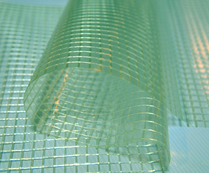 Green White Transparent Clear Poly Pvc Laminated Mesh Tarp
-
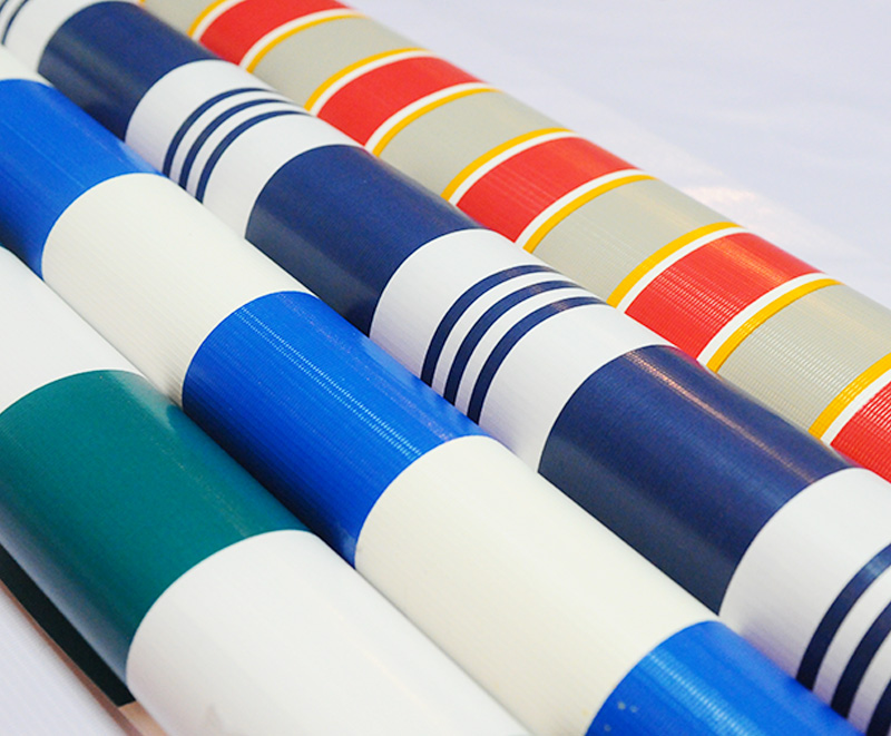 Colorful Printing Striped Tarpaulin Fabric Roll
-
 Knife-coated Membrane Material
-
 Knife-coated Retractable awnings
-
 Industrial-Grade covering tarpaulin
-
 PVC Truck tarpaulin
 +86-573-88890126
 adam@ml-holding.cn
 No. 28, Shuguang Road, Tudian Town, Tongxiang City, Zhejiang Province, 314503, China
Copyright © Zhejiang Minglong New Material Technology Co., Ltd. All rights reserved.
